The Giver Process Work
The Giver Process Work
Illustration Process
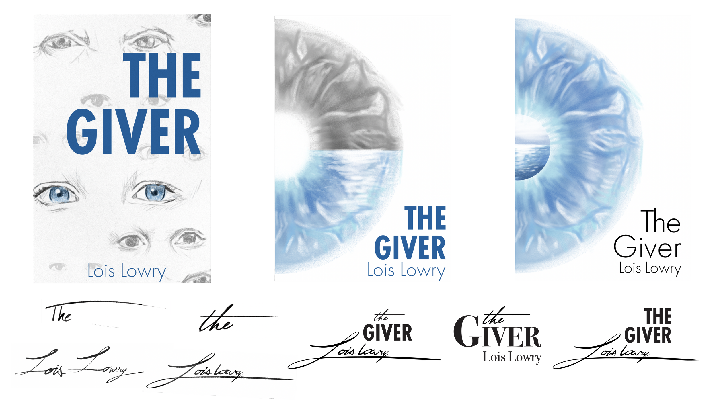
I decided to explore the pale eye motif from The Giver, which symbolizes the ability to see beyond the uniformity enforced in the society. After receiving feedback from professors and peers that the eye was compositionally strong but lacked thematic complexity, I decided to introduce a second element into the design. I explored several concepts, including monochromatic versus color, character, and water. Water became the most compelling direction because it is an important motif in The Giver, symbolizing freedom, danger, and the physical boundary surrounding the community.
Typography Process
I started my typography process by researching different fonts used in book design and created a list of typefaces that I felt matched the tone of the novel and my cover design. However, I still felt the typography lacked the human element essential to the story. I decided to create my own handwritten font as an homage to the original cover design. After experimenting with a variety of brushes, pens, and lettering styles, I used Adobe Illustrator to refine and clean up my final design. I then explored several typographic compositions before settling on my final cover design.
The Giver Mechanical