The Bassumtyte Treasure Process Work
I created a series of works based on the middle grade mystery novel: The Bassumtyte Treasure. Inspired by special edition book designs, I developed a book cover, endpapers, page borders, chapter headers, and an interior illustration. I incorporated elements of interactivity throughout the collection, which manifested through interactions between the illustrations and the reader, between images and text, and between the illustrations and the narrative. This project helped me understand how to maintain a consistent tone and visual style across multiple pieces, each with distinct purposes and moods.
I created the cover art first. I knew I wanted it to be illustrative with a designed border, so I explored various concepts using visual motifs from the story. Once I decided to focus on the mansion, with the characters featured on the back cover, I experimented with different house designs to capture the whimsical and mysterious nature of the building while remaining accurate to its time period and location. I also experimented with the color palette, knowing that the final choice would establish the visual direction for the rest of the collection. I chose the purple and gold palette, which conveyed the mystery and playful qualities of the story.
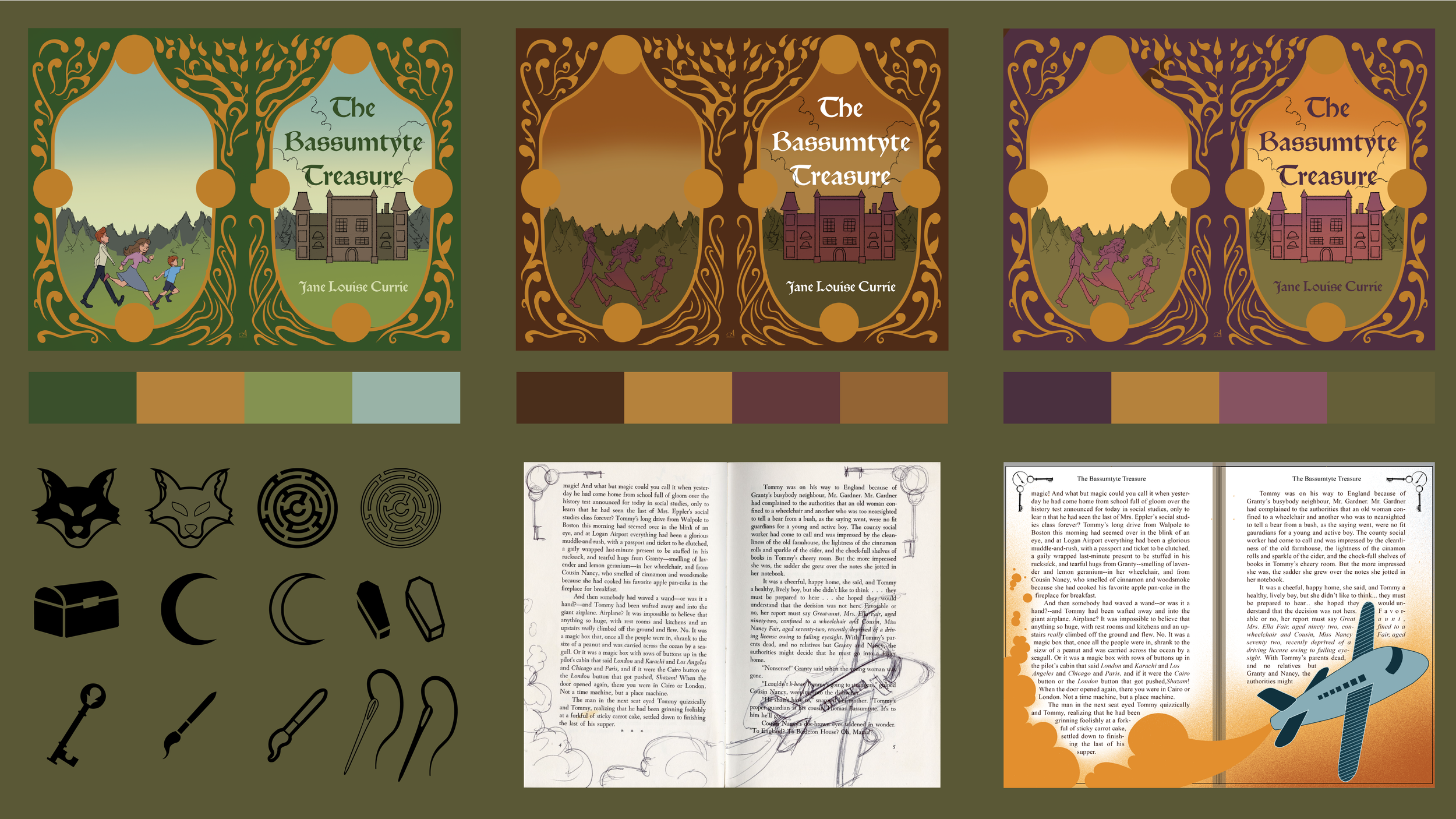
Because this novel is a mystery, I wanted every element of the design to contain clues to the story without revealing too much. The symbols incorporated into the border are all clues that become significant later in the story, while the tree that makes up half of the border is also an essential element of the mystery.
While designing the page borders, chapter headers, and the end papers, I knew I wanted each piece of the collection to feel interconnected. I created an asset library of simple illustrations based on visual motifs present in the novel. I was then able to adapt and reuse these illustrations across the projects. They became symbols in the cover border, the keys were used to create the page border, and creating a pattern for the endpapers. For the chapter header, I drew inspiration from Elizabethan-era architecture to connect the visual language to the setting and themes of the story. For the interior illustration, I wanted to explore how the shape and placement of text could interact with an illustration, allowing the typography and imagery to work together in order to engage the reader.
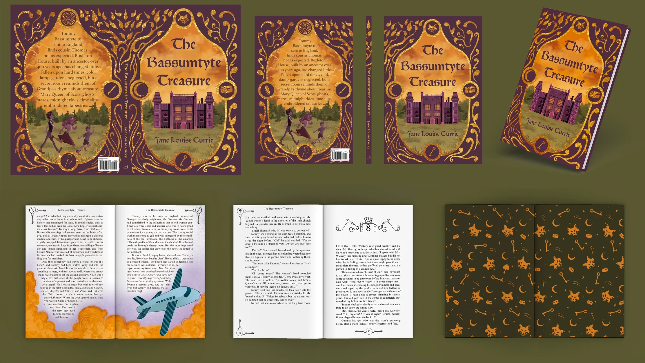
The Bassumtyte Treasure Final